2013-11-06
(Redirected from 3167)
Jump to navigation
Jump to search
| 2013-11-06 |
 Title text: 2013-11-06 |
Votey
Explanation
| This explanation is either missing or incomplete. |
Transcript
| This transcript was generated by a bot: The text was scraped using AWS's Textract, which may have errors. Complete transcripts describe what happens in each panel — here are some good examples to get you started (1) (2). |
- [Describe panel here]
- The Top
- Reasons This Infographic
- Is Just Wrong Enough
- To Sound Convincing
- All of our information is from Wikipedia, stuff we heard in science survey courses but never fact-checked, and assertions by clearly biased organizations.
- According to Infographic Sellers of America" 100% of businesses can benefit from infographics regardless quality.
- Beneficial Business Areas
- This is confirmed by sociology psychology`, and political economy
- We use statistics that are only important if you don't think about them.
- 100% of canadas" contain potential infographic readers
- 100%
- Did you know, the number one source of current infographic readers is potential infographic readers?
- 3
- We move seamlessly between real dollars, nominal dollars, and percentages.
- $1,000 For just 1% of YOUR BUSINESS'S budget which may low as $1,000 1844 money you could have 31,000 cash, RIGHT NOW $31,000 o o o
- %
- We have line graphs with absurd scaling AND two variables on the same axis.
- 0.1%
- 8
- Average Growth Difference Between Infographic Using Companies And Non Infographic Using Companies
- Number Of
- Neurons Engaged In Infographic Consumption
- Per Second
- c.c%
- o
- Time
- We use polar area diagrams. Ever.
- 99% the time bar graph would've been better
- 70% time, pie chart
- would've been better
- 50% of people will never see polar area diagram outside
- of this polar area diagram
- 100% polar area diagrams look really cool"
- 4% humans even know
- how calculate the area of
- a circular sector'
- 83% humans are bad at
- estimating area when isn't
- shaped like rectangle
- 100% this slice doesn't
- touch the center the graph.
- What does that even mean?
- We have so many asterisks" after our claims that it'd take a week` to determine whether anything in the
- diagram is meaningful.
- Reference: Books ret existent. Asterisks for semblance of authority **** They're like saws mohawks something ##### Is the title of a Malcolm Gladwell book
- Source. This diagram ####### ******** ******** #######
- Bv Zach Weiner, SMBC (smbc comics com) & Illustrated by Ross Nover, FPO (systemcomic .com)
- Click to buy a poster of
- This comic/
Votey Transcript
| This transcript was generated by a bot: The text was scraped using AWS's Textract, which may have errors. Complete transcripts describe what happens in each panel — here are some good examples to get you started (1) (2). |
- [Describe panel here]
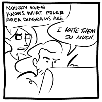
- Nobody even knows what polar area diagrams are.
- I hate them so much. Of in
![]() add a comment! ⋅
add a comment! ⋅ ![]() add a topic (use sparingly)! ⋅
add a topic (use sparingly)! ⋅ ![]() refresh comments!
refresh comments!
Discussion
No comments yet!
